EVE Online’s had radial menus for a long time now, and I’ve personally found them to be terrible. Every so often I’ll be clicking around to do something and suddenly I’m having to confirm if I want to eject from my ship in the middle of a battle. When Odyssey was being previewed on the Fanfest video feed, it was mentioned that attention was being paid to revamp the game’s radial menu system; half of the me cringed, the other half was somewhat intrigued.
It’s no secret that EVE has a considerable reputation as having a user interface that’s more like an office application suite than a game. Over the last year or so, CCP has put a ton of effort into improving the game’s interface and making things a lot more usable, while at the same time keeping the functionality intact. With Odyssey, the first steps towards revitalizing the mouse clicks you make on your most common tasks is coming. I decided to take these new changes for a spin on Singularity.
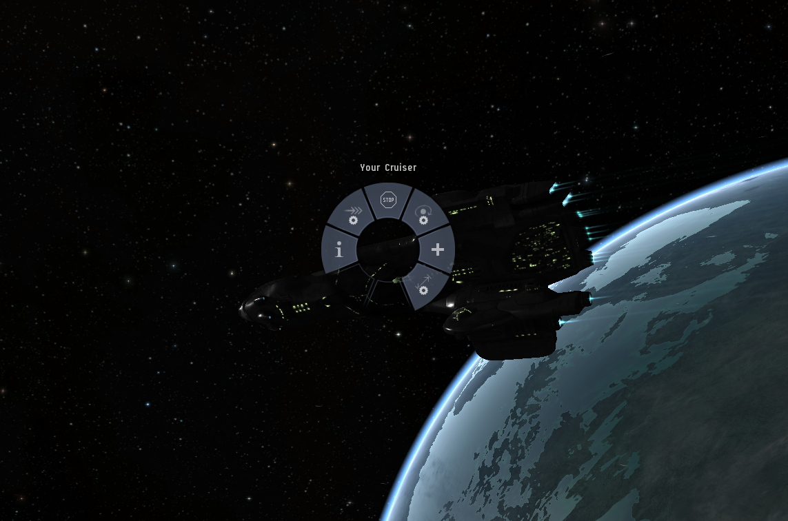
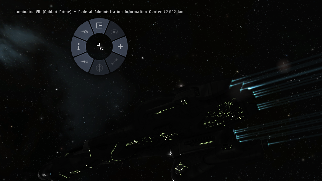
Clicking and holding the left mouse button on your ship pulls open the new eight-slice radial menu. CCP has previously written that all the radials will contain eight slices, making sure the items on that menu will be the ones that should be there. The overall concept is simple:
- Primary functions at 12:00
- Submenu at 3:00
- Targeting at 6:00
- Show Info at 9:00
- Navigation options each of the 45 degree slices
In the case above, the ship is missing a couple of slices since you can’t target yourself, nor can you do something weird like orbit yourself.
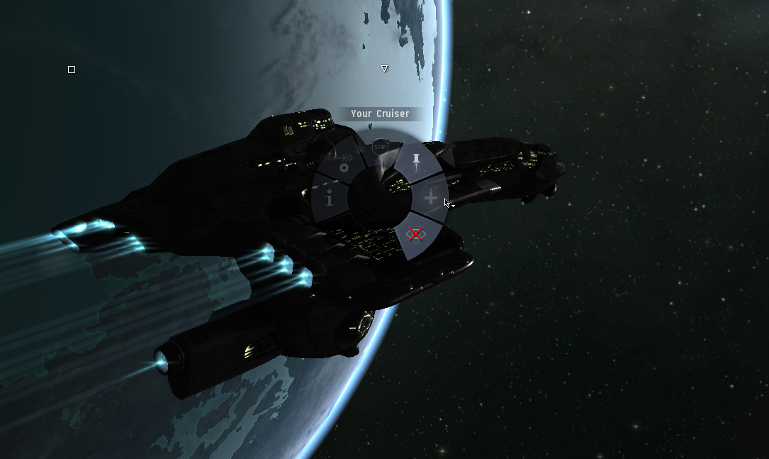
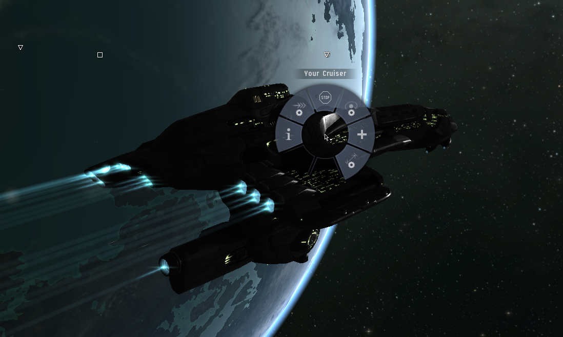
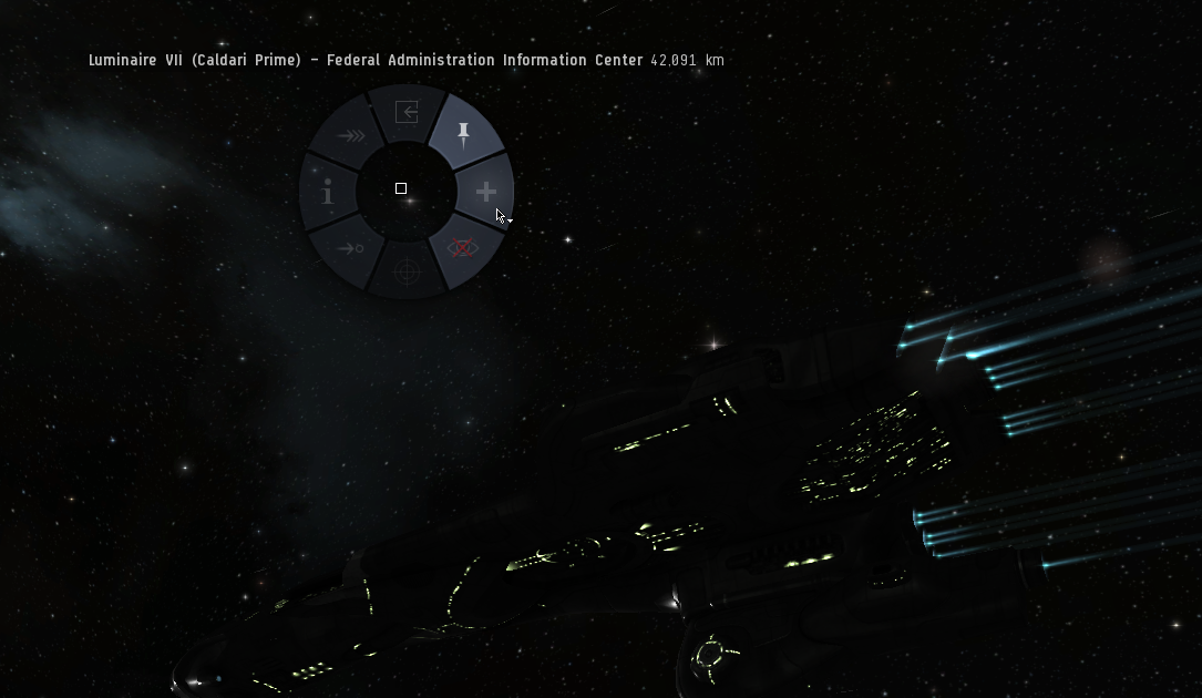
Zipping your pointer to the right changes the side three slices to let you reset the camera and bookmark your current location. The action can be performed quickly.
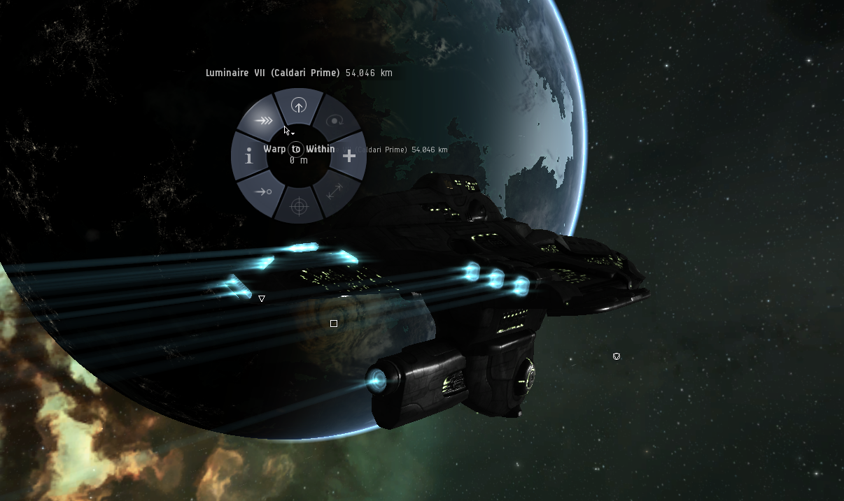
Other menus are available for items like planets and stations, each with their own tailored set of commands.
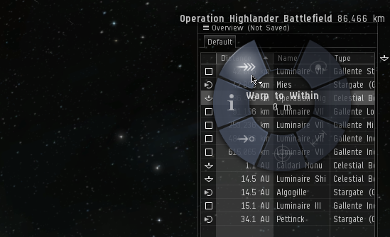
Items on the overview will also show the new radials, and this is where the interface kind of accidentally hits itself in the face while reaching for greatness. Two competing visual styles come together like milk and lemon juice, turning the simplicity of the overview into a Mensa test. It’s still functional, but I wonder if the clutter at the wrong time might lead to an undesirable outcome.
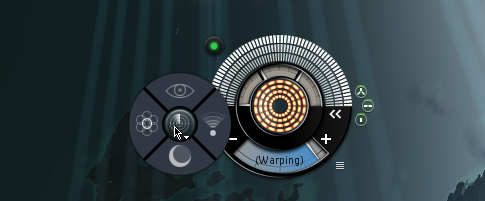
The other place receiving radial treatment is the HUD. Specifically, the scanner button now flings out a four slice menu, letting you (clockwise from top) toggle on the new sensor overlay, activate directional scanning, analyze moons, and jump into the probe scanner.
So far I’m interested in the direction they’re going with this. Radial menus normally aren’t the most awesome UI concept, but CCP’s method of implementing them shows a considerable amount of forethought. Using them can be fast and intuitive, and the consistency of where commands are located means that with very little practice you can probably fire off commands faster than the normal right clicking method.
Nice job, Team Pony Express.